Step 1. The Beginning — “We Counted Only Deaths”
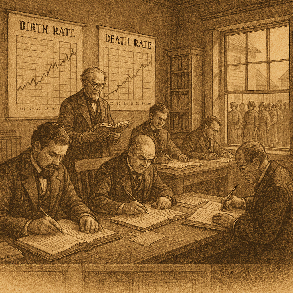
In the early years of public health, we only asked:
“How many people died this year?”
So we used simple measures of mortality:
- Crude Death Rate
- Infant Mortality Rate
- Life Expectancy at Birth
✅ These told us how long people lived.
❌ But they didn’t tell us how well they lived.
Example:
Two countries can both have a life expectancy of 70 years.
But in one, people live happily and healthy till 70.
In the other, they suffer from disability, poverty, and disease for half their life.
So people asked —
“Is living longer the same as living better?”
That’s when the idea of “Quality of Life” began.
Step 2. The Realization — “Life ≠ Health”
In the 1970s, WHO defined health as
“A state of complete physical, mental and social well-being, and not merely the absence of disease or infirmity.”
But — how do you measure that?
You can measure blood pressure or blood sugar.
But how do you measure well-being or social satisfaction?
So, the world started experimenting with ways to quantify health in meaningful terms.
The first idea was simple:
Let’s not just count how many years people live —
let’s count how many healthy years they live.
And that gave birth to our first index…
Step 3. The First Big Step — HALE: Health-Adjusted Life Expectancy
HALE asks:
“Out of the total life expectancy, how many years are lived in good health?”
It adjusts the total life expectancy by subtracting years lived with disease or disability.
🧠 Example:
If life expectancy = 70 years,
and average unhealthy years = 10 years,
then HALE = 60 years.
So, HALE taught us that:
Living long is not enough — living healthy matters more.
✅ Advantage:
- Combines quantity + quality of life
❌ Limitation: - Doesn’t tell us how much burden diseases actually create on society.
That question led to the next breakthrough.
Step 4. “We Need to Know How Much Disease Costs Us” → DALY
Imagine a young man of 25 dies from tuberculosis.
He loses about 40 years of potential life.
Another person of the same age lives, but becomes blind — he loses many years with disability.
We needed a way to measure both in one unit.
That gave us DALY — Disability Adjusted Life Year.
DALY = Years of Life Lost (YLL) + Years Lived with Disability (YLD)
💬 It tells us: “How many years of healthy life are lost due to disease or disability?”
Example:
If in a population, malaria causes 100 deaths and 1000 people live with illness,
DALY measures total loss from both death and suffering.
✅ Advantage:
- Gives a single measure of disease burden
❌ Limitation: - DALY is a negative concept — it shows what we lose, not what we gain.
So health economists thought:
“Instead of calculating what we lose, why not calculate what we gain with treatment?”
And that gave us the next evolution.
Step 5. The Flip Side — QALY: Quality Adjusted Life Year
While DALY measures loss,
QALY measures gain — the positive side.
QALY = Life Years × Quality of Life Weight (0 to 1)
If a treatment adds 1 extra year of life at 0.8 quality, it gives 0.8 QALYs gained.
If a surgery adds 5 years at full health, that’s 5 QALYs.
✅ Advantage:
- Helps compare cost-effectiveness of treatments
- Used in health economics and clinical decision-making
❌ Limitation:
- Still health-focused
- Doesn’t include social and economic well-being
So again, experts asked —
“Health is just one part of life. What about education, income, and dignity?”
Now the story moves from hospitals to nations.
Step 6. When Economists Entered the Chat — PQLI: Physical Quality of Life Index
By the late 1970s, policymakers realized that health depends on social conditions too.
So they built PQLI, a broader measure.
PQLI = Average of 3 things:
- Infant mortality rate
- Life expectancy at age 1
- Literacy rate
It was simple, people-centered, and gave a sense of basic life quality.
✅ Advantage:
- Included literacy, a social factor
❌ Limitation: - Didn’t include income
- Too limited for international comparison
So in 1990, the UNDP took this forward.
Step 7. The Global Revolution — HDI: Human Development Index
The Human Development Index (HDI) combined:
- Life expectancy (Health)
- Education (Mean & Expected Years of Schooling)
- Income (GNI per capita, PPP $)
Each dimension was normalized and combined (0–1 scale).
✅ Advantage:
- Balanced view: health + knowledge + income
- Allowed fair comparison across countries
❌ Limitation:
- Didn’t show inequality or poverty depth
So UNDP refined it again.
Step 8. “Not Everyone Benefits Equally” → HPI: Human Poverty Index
Even in rich countries, pockets of poverty exist.
So UNDP created HPI (Human Poverty Index) — the mirror image of HDI.
It measures deprivation in:
- Longevity (people dying before 40)
- Knowledge (illiteracy)
- Decent standard of living (lack of access to basic needs)
✅ Advantage:
- Shifts focus to inequality and deprivation
❌ Limitation: - Still doesn’t capture subjective happiness
That brings us to the next generation of indices.
Step 9. “Are People Happy?” → WHOQOL and GNH
By the 1990s, researchers realized that neither HDI nor DALY could tell us if people actually feel satisfied.
So two different approaches came up:
1. WHOQOL (World Health Organization Quality of Life)
WHO developed questionnaires that ask people:
“How do you feel about your health, relationships, environment, and life?”
It’s subjective — about perceived well-being.
2. GNH (Gross National Happiness) — from Bhutan 🇧🇹
They said:
“GDP measures money, not happiness. We’ll measure happiness itself.”
It includes:
- Good governance
- Cultural values
- Sustainable environment
- Psychological well-being
✅ Advantage:
- Measures true contentment
❌ Limitation: - Hard to compare globally (too culture-dependent)
Step 10. The Present — Blended Indices
Today’s world uses a mix:
- World Happiness Index — combines income, freedom, trust, and life satisfaction
- Multidimensional Poverty Index (MPI) — replaces HPI, measures deprivation in health, education, and living standards
- Inequality-adjusted HDI (IHDI) — adjusts HDI for income and social inequality
So, the evolution continues.
SUMMARY FLOW
Let’s stitch it all together in one memory-friendly chain:
| Era | Problem We Saw | Solution Index | Focus |
|---|---|---|---|
| Early Public Health | We only counted deaths | Life Expectancy | Longevity |
| 1970s | Living long ≠ living healthy | HALE | Healthy life years |
| 1980s | We need to measure disease burden | DALY | Years lost to disease |
| 1990s | We should measure gain too | QALY | Years gained with good health |
| 1970s–80s | Health depends on society too | PQLI | Basic quality of life |
| 1990s | Need global measure | HDI | Health + Education + Income |
| 2000s | Development unequal | HPI → MPI | Deprivation |
| 1990s–2000s | Numbers ≠ happiness | WHOQOL, GNH, WHI | Subjective well-being |
💬 In One Sentence
“We started by counting deaths,
then we counted diseases,
then we counted development,
and finally, we learned to count happiness.